Color Your Home Happy
As a Boston-area interior designer who specializes in color, the first question clients often ask me is what color I think their room should be. But because I typically need to ask them a range of other questions, and talk about pattern and fabric, before we land on a hue, I’d like to share some of the knowledge and philosophies that underpin my work.
First, choosing color is hard not only because there are so many options -- Benjamin Moore has 3,500 paint hues to choose from -- but because there are so many combinations, as well. Add to that personal taste, the mood you’re trying to create, the amount of light and size of your room, whether you are working with any existing furniture, rugs or drapery, and well, pull up a chair!
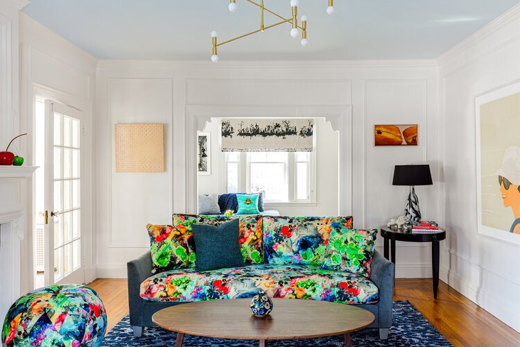
This living room is filled with happiness and inspiration with the sofa and pouf covered in Graffiti Splatt by Timorous Beasties and is balanced with white walls. The ceiling was not forgotten with Benjamin Moore’s A Breath of Fresh Air.
Color can bring happiness. Think about how you feel in the natural world: the sky, trees, plants, flowers, fruit, vegetables and birds are all colorful and lift our spirits. French architect Le Corbusier claimed that color “is an element as necessary as water and fire.” Can you imagine the world only in black and white or grey?
Color also is a powerful design tool that shouldn’t follow trends necessarily but take a personal, holistic and human-centric approach, focusing on the emotions, feelings and moods you want a space to have. Let color excite, inspire, tantalise or calm.
So let’s discuss some tips on how this most important design tool can do all of those things.
TIP 1. Choose a color palette for the whole room, not just a wall color, which easily falls into place once the former is decided. Color should flow and connect room to room so you do not feel like your house is a Disney ride. Your color palette can come from fabrics, a rug that is already in the space, art, or perhaps window treatments. I love starting with a glorious multi- colored fabric that will be used as a pillow or a few fabrics in solid colors.

In this bathroom I started with the window treatment fabric by Ferrick Mason to decide the wall color (Yeabridge Green). The mirror is Peignoir , all by Farrow and Ball.
TIP 2. Clients are always asking for lighter and brighter and like everyone I love a fresh coat of white paint. However, it isn’t just white that makes rooms light and bright; saturated colors can play this role, too, even if it’s a pastel. The key observation is how much light enters into the room or space. In a small, windowless powder room, it will not get bigger or brighter with white paint since there is no natural light for it to bounce around. Instead, try high gloss, metallics, glass and mirrors to bounce around light and that will do the trick. If white is the answer there are many to choose from. Super White and Horizon, both by Benjamin Moore, are two of my favorites. Be sure to add your color in other places so you aren’t finding yourself in a room that is too reminiscent of a dentist’s office.

This windowless powder room looks smashing and bright with Farrow and Ball’s Verdigris and the colorful Anthropologie hand towel ties together the wall and art perfectly.
TIP 3. Moulding and ceilings do not have to be white. In fact, I highly recommend that they are well considered. I love painting all the moulding and ceiling the same colors as the walls. This is a very modern and calming look. Your eye isn’t going from wall to ceiling to moulding, it is just relaxing on one color. This trick beautifully raises the ceiling higher and expands the width of the room, as well, since there is no breakup or white lines coming at you. I also love doing the moulding a slightly lighter version of wall color like this beautiful living room that has Farrow and Ball’s Charleston Gray on the walls and Elephant’s Breath on the moulding and ceiling. The teal June sofa by Verellen pops with alongside the graphic Romo fabric on the Cisco Home Dromedary sofa.

Below, the Hague Blue that adorns the walls, baseboard, crown moulding and ceiling make this kitchen modern and sexy. The pop of the yellow Gubi Beetle chairs to go with the Tom Dixon Beat lights balance the blue while highlighting the Butterfly Parade fabric by Christian LaCroix on the banquette.
